Everything needed to make something look and sound like NutHouse: the mark, Hazel, the colours, the type, the pixel-art rules, the motion and the words. Every value here is the one the app itself uses, lifted from its stylesheet and its icon.
Scope: the NutHouse app, its exported games and this website. If a value here disagrees with the app, the app wins and this page gets fixed.
Story & name
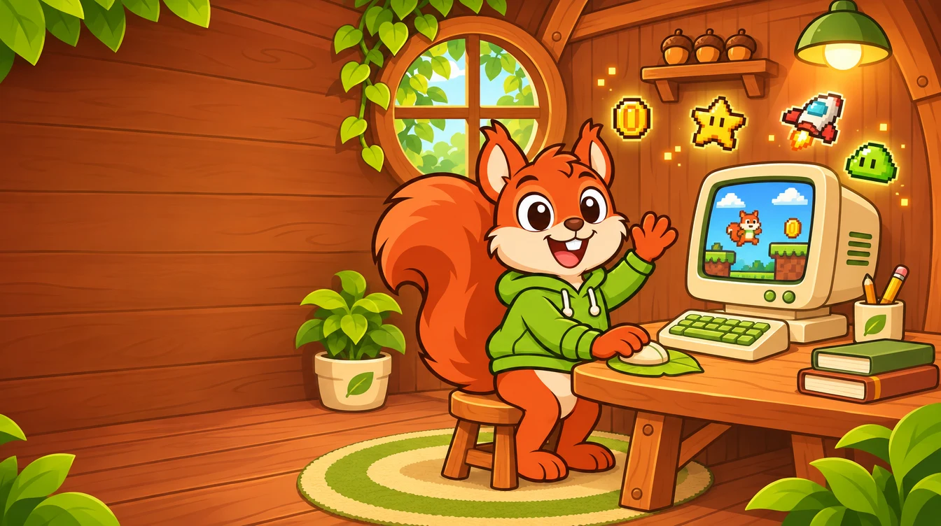
A nut house is a safe, silly place to stash the things you love and build something out of them. Hazel the squirrel lives there. The two acorns are the two halves of making a game: the drawing and the rules. The wooden house is the editor, warm and hand-made.
Writing the name
NutHouse :: The Game Maker is the full name. Two colons with spaces either side, Title Case. Use it once, at the top of something, then just say NutHouse.
NutHouse is one word, capital N, capital H. Never “Nut House”, “Nuthouse”, “NUTHOUSE” or “NH”.
Hazel is the mascot, not the product. “Hazel shows you…”, never “NutHouse the squirrel”.
Files are .nuthouse. In prose say “a NutHouse game”, never “a .nuthouse”.
The mark
One picture, used everywhere: Hazel in her wooden house frame with an acorn in each corner. It is the Mac app icon, the toolbar mark, the favicon and the header of this site. It is a painted image, not geometry, so always use the PNGs from the kit and never redraw, trace or vectorise it.
The markThe app icon and the default everywhere. Transparent corners outside the tile.
Below 32 px Hazel’s face becomes a warm blob in a green tile, and that is fine: the green tile is the thing a tab or Dock shows at a glance.
In the toolbar
NutHouse
NutHouse
24 px mark, word at 17 px / 800 / 0.02 em tracking, Nut in acorn and House in leaf. This is the smallest the lockup goes.
Don’t
Rotate it
Stretch it
Recolour it
Add effects
Square the corners
Make it one colour
Colour
Bright, warm and for kids. Leaf is the one green used as text: links, selection, tabs. Grass is the bright surface green with dark text on it. Acorn orange is for emphasis and calls to action, always with dark text. Sun, Sky and Berry are the fun accents for badges, confetti and tints. The website is light only; the app follows the Mac’s light or dark setting with the same accents.
Click any swatch to copy its hex. Ratios are against the page (sand), the app’s dark window and for white text on the colour. Bright colours are surfaces, not text: put Ink on them.
The 32 colours in the sprite editor: the PICO-8 palette and its secret extended set. Every built-in sprite and background uses only these. Hover for the hex, click to copy.
Leaf is the interactive accent: links, selected tabs, focus of the moment. In the app’s dark mode it lifts to #7ddc5f.
Acorn is the emphasis accent: primary buttons, Share, badges, always with Ink text on it. As text (the Nut in the wordmark) it darkens to Acorn text; for brown body text use Acorn deep.
Play green is only for Play and success. Spot blue is only for focus rings and the tutorial spotlight. Never swap them.
Coin yellow is a kid accent: badges, stars. Never for text on white.
Trigger red marks one-off conditions and NOT in the event editor. Danger red is for Delete. They are different reds on purpose.
Bright colours are surfaces. Grass, Acorn, Sun, Sky and Berry never carry text lighter than Ink. Leaf and Acorn deep are the only brand colours allowed as text on light.
The website is light only. No theme toggle. The app keeps the Mac’s light or dark setting; its dark surfaces are neutral grey, not green.
Body text is --fg on --bg. Secondary text is --muted, which still passes 4.5:1. Nothing lighter than --muted is ever text.
Typography
Two voices. Outfit (self-hosted, variable weight) for headlines and anything that should feel like a game, and the system font for body copy and anything that should feel like a Mac app.
Display 1 · Outfit 900 caps
Make your own games.
Display 2 · Outfit 900 caps
Draw. Build. Rules. Play.
Display 3 · Outfit 900 caps
Add a paddle
Lead · system 20-22px
Draw characters, build levels and write the rules that make them play.
Body · system 17/1.55
The paddle is the bat you move to hit the ball. Click + Add object, then Balls & Paddles, then Paddle.
App heading · system 700
Share your game
App UI · system 15/1.4
Snap to grid · Level 1 · 640×480 · Gravity pulls: Down
Small · 13px
Step 3 of 30 · Press Cmd+Z to bring it back
Mono · ui-monospace 15
10 + Speed("Ball") * 2
In-game text · monospace 20
Score: 0 Lives: 3
The app uses the system font only (-apple-system, BlinkMacSystemFont, 'Segoe UI', sans-serif) at 15 px / 1.4. It loads no web fonts, so it opens instantly and looks native.
Outfit (variable, 100-900, served from /assets/fonts/, no third-party font requests) is for the website, Hazel’s world and marketing. Display text is weight 900, all caps, with 1-7% tracking; nav items and buttons are 800 caps with 7% tracking. Never inside the app’s panels.
Headings are heavy caps, balanced (text-wrap: balance), line-height 1.02. Body copy stays mixed case in the system font so long text is easy to read.
Nothing readable goes under 13 px in the app or 15 px on the web. Numbers that update use tabular figures.
Code, formulas and keyboard keys are monospace. Keys are drawn as ⌘Z keycaps.
Shape, space, elevation
Rounded, but not bubbly. Controls are 8 px, dialogs 12 px, cards 14 px, pills fully round. The same numbers as the app.
Radii
4 · tag
6 · input
8 · control
12 · dialog
14 · card
pill
Elevation
Cardedge only, no shadow in the app
Website card0 8px 24px / 8%
Popover0 10px 32px / 30%
Dialog0 16px 48px / 35%
Transparency
Anywhere a picture can be see-through, show the checkerboard: #e6e6e6 and #fafafa, 8 px squares at 1×. Never a plain grey.
Spacing
The app spaces on a 4 px grid (4, 8, 12, 16, 24, 32). The website uses clamp() gutters from 16 px on phones to 40 px on desktops, with a 1180 px content column.
Hazel
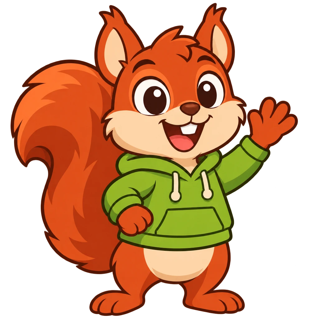
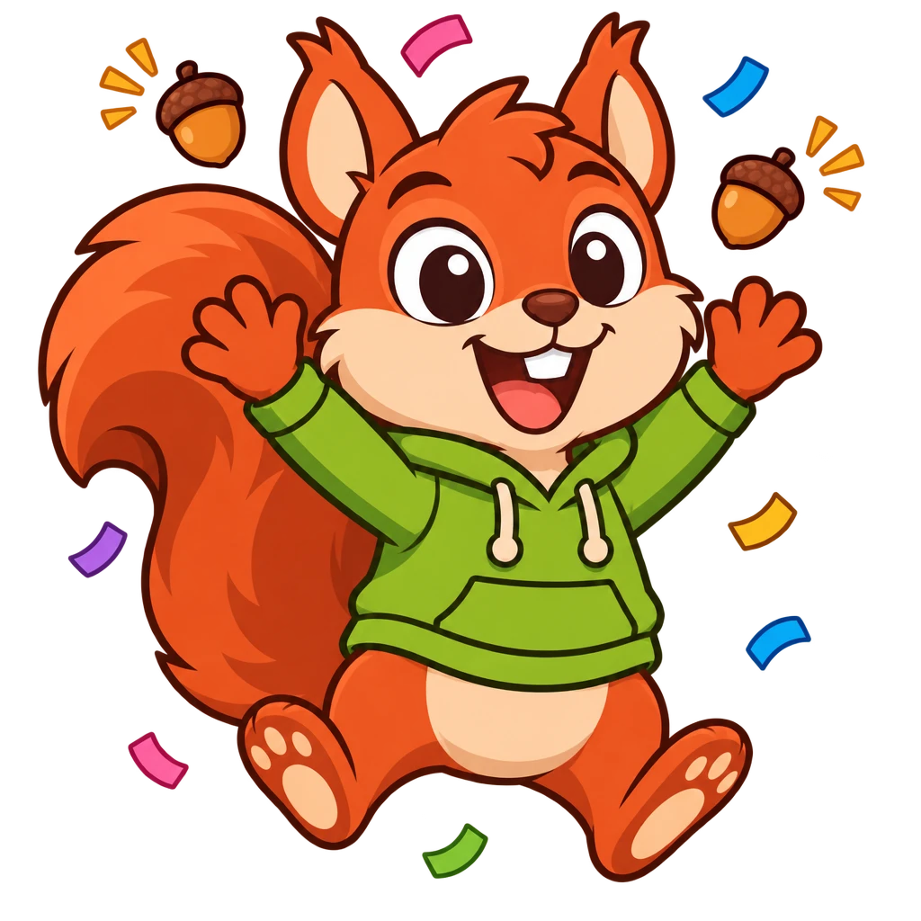
Hazel the squirrel is both the guide and the cheer: she explains, hints and teaches, and she celebrates when something works. A kid meets her on the website, in the help centre and in the tutorial. She is encouraging, a bit silly, and never scary.
WaveHello, welcome, the help centre, empty statesPaintDrawing, the sprite editorThinkHints, Teach me, the 404 pageCheer“You made a game!”, sharing
Her workshop
Style: flat vector cartoon, bold clean outlines, soft cel shading, brand palette only. Hazel is ginger with a cream belly and a leaf-green hoodie; her acorns are Acorn brown with Acorn-deep caps.
Guide, not hero. She never appears inside a game or as a library sprite. The kid is the hero of their game.
She never holds a NutHouse logo, never wears anything but the hoodie, and never talks in speech bubbles with more than five words.
Mascot art is transparent WebP at 1024². Don’t crop her tail or her ears. New poses are drawn from the Wave pose as the reference so she stays the same squirrel.
Pixel art
Everything inside a game is pixel art, and it is proud of it. Sprites are drawn by code in the library and by hand in the sprite editor, from the same 32 colours.
Hero · 36×39
Slime
Coin
Ghost
Spaceship
Key
Grass · 32×32 tile
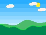
Sunny hills · 640×480
Always render pixelated.image-rendering: pixelated on every canvas and every sprite image, in the app, in exports and on the web. Blurry pixels are a bug.
Whole pixels. Sprites scale by whole numbers (1×, 2×, 3×…). The play overlay fits the level to the window in whole steps.
Tiles are 32×32. Characters are 32 to 40 px tall. Collectables are 16 to 24 px. Backgrounds are 640×480.
One-pixel outlines in the darkest nearby palette colour, not black, except on very dark backgrounds.
Two special points live on every sprite: hot spot (the handle, drawn as a blue cross)action point (where shots come out, orange)
Motion
In the app, motion is for attention and feedback only: the spotlight pulse, a toast sliding in, a tab switching. On the website, motion can show off: the rolling meadow, the bobbing acorn, the floating sprites.
+ Add objectNice one!
Spotlight pulse: a 3 px spot-blue ring expanding 0 → 8 px every 1.2 s, ease-out. The only looping animation inside the app.
Durations: 150 ms for hover and press, 200-300 ms for panels and tabs, 600-900 ms for website reveals. Ease is cubic-bezier(.2,.8,.2,1); “back” easing only for celebrations.
Reduced motion wins. Under prefers-reduced-motion the pulse stops, marquees become wrapped lists, the 3D meadow becomes a still, and every reveal is instant. The page must be complete without motion.
Nothing moves behind text a child is trying to read. Decoration lives beside copy, not under it.
Sound
Seven built-in sounds, each synthesised by a few lines of code: short, bright, 8-bit. They are the sound of NutHouse.
Sounds are 8-bit mono WAV at 22 050 Hz, under 20 KB each, generated on demand. There are no sound files in the app bundle.
The app itself is silent: no click sounds, no chimes. Only games make noise, and only when the player presses Play.
The website is silent unless a visitor presses a Play button.
Voice & tone
NutHouse talks like a patient older cousin who is really good at games. Plain words, short sentences, British spelling, and it never makes you feel stupid.
Say
“The dark blue box is the level: the stage where your game happens.”
“Nice one!”
“Press Cmd+Z to bring it back.”
“Nothing found. Try another word.”
Don’t say
“The frame viewport represents the active scene instance.”
“Success.”
“Deletion complete. This action cannot be undone.”
“No results matched your query.”
Reading age ten. Grade 6 or below. If a sentence needs a comma and a semicolon, it is two sentences.
Second person, present tense. “You bounce the ball.” Never “the user”.
British spelling: colour, centre, grey, “wrap round”.
Encouraging, not gushing. One “Nice one!” per step. No exclamation marks in instructions, one in celebrations.
Name the button. “Click + Add object” in bold, with its real label, and the spotlight on it.
Grown-ups get the same voice, with more facts: file formats, privacy, versions.
Glossary
NutHouse renames the classic game-maker words so a kid can guess what they mean. Use the left column everywhere a kid can see it. The right column is only for code.
Say
Not
What it is
Level
Frame
One screen of the game
Levels
Storyboard
The list of all the levels
Sprite
Active object
A thing that moves and animates
Block
Quick backdrop
A coloured rectangle
Background
Backdrop
A picture tile
Rule / Event
Event line
When … Do …
Condition
Trigger / test
The When half
Action
Command
The Do half
One-off
Triggered condition
Happens once, when it happens
Value
Alterable value
A number an object remembers
Switch
Flag
On or off
Formula
Expression
Maths in a box
Play
Run
Start the game
Sprite editor
Picture editor
Where you draw
Share
Export / build
Make the one-file web page
Picture
Frame (of animation)
One drawing in an animation
Facing
Direction
Which way a sprite looks
Rules
Each one of these was a mistake once.
The mark is a picture. Use the kit PNGs at the size you need; never trace, vectorise or redraw it, and never ship it as an SVG.
Two accents, two jobs. Leaf for everything interactive. Acorn for emphasis and calls to action. Play green only for Play. Yellow only for fun.
Green is an accent, not a wallpaper. Pages are sand. The big green surfaces are the CTA band and the footer, nothing else.
Pixelated or nothing. Any sprite shown anywhere is rendered with nearest-neighbour scaling.
Real screenshots. Marketing shows the actual app, captured by script, in both light and dark. No mock-ups, no invented panels.
Kid words everywhere a kid can see. The glossary is not optional.
Hazel beside, never behind. She decorates; she never sits under text.
No accounts, no tracking. The brand promise is privacy. The website carries no analytics scripts and no cookies.
Dark mode is not an afterthought. Every surface is designed in both and checked in both.
Original art only. Everything in NutHouse is drawn for NutHouse.
Downloads
Everything on this page, in one zip. The files are generated by npm run site:brand from the app’s own icon, so they never drift.


 WaveHello, welcome, the help centre, empty states
 PaintDrawing, the sprite editor
 ThinkHints, Teach me, the 404 page
 Cheer“You made a game!”, sharing